

From paper notesto auto-logged calls
The interaction panel is the core mechanic of CSRD, a desktop for telecom call-centre operators. It took five versions to turn a form people avoided into a panel that does most of the logging for them.
CSRD is a box product customised for every telco — business processes differ even between Telefonica Uruguay and Telefonica Ecuador. Contracts run 10–15 years, and privacy policies make direct user feedback rare and slow.
So decisions rested on three sources — customer requirements, sales requests and usability studies — and one test: does it move FCR, AHT, ACW or training time?
Designing for people who won't stay long
1st line operators answer common questions and route the rest; 2nd line specialise in billing, tech or complaints. Most use little beyond messengers and office apps — and their salary can depend on KPIs.
Logging an interaction was the job nobody did
Every call, chat or email has to be resolved and logged correctly — to pass it to another line and to improve service later. In practice:
Poor interaction logging
The process of categorisation was so complicated (up to 5 levels), that the operators would select 'Other', leave the description blank, or write notes on paper and then fill them in afterwards, either at the end of the call or after the shift.
3–5 minof after-call work per interactionManual search for everything
An app per channel
Chat, email, SMS and calls lived apart and were tied to the customer by hand.
One account at a time
Updating a previous interaction meant a new browser tab and lost context.
Caller ≠ customer
A caller may only represent the account owner, which changes what can be shared or done — and the UI didn't show it.
Sales, business and research pulled in different directions. Each version settled one argument.
What customers used before the cloud migration
- Not automated at all, with three mysterious buttons — Ticket, Dispute, Retention — though a dispute operator never does retention.
- No object linking, so details went to notes — or paper.
- Tickets created by hand, adding to after-call work.
- Flat subject and category: no deep categorisation, no multiple reasons.
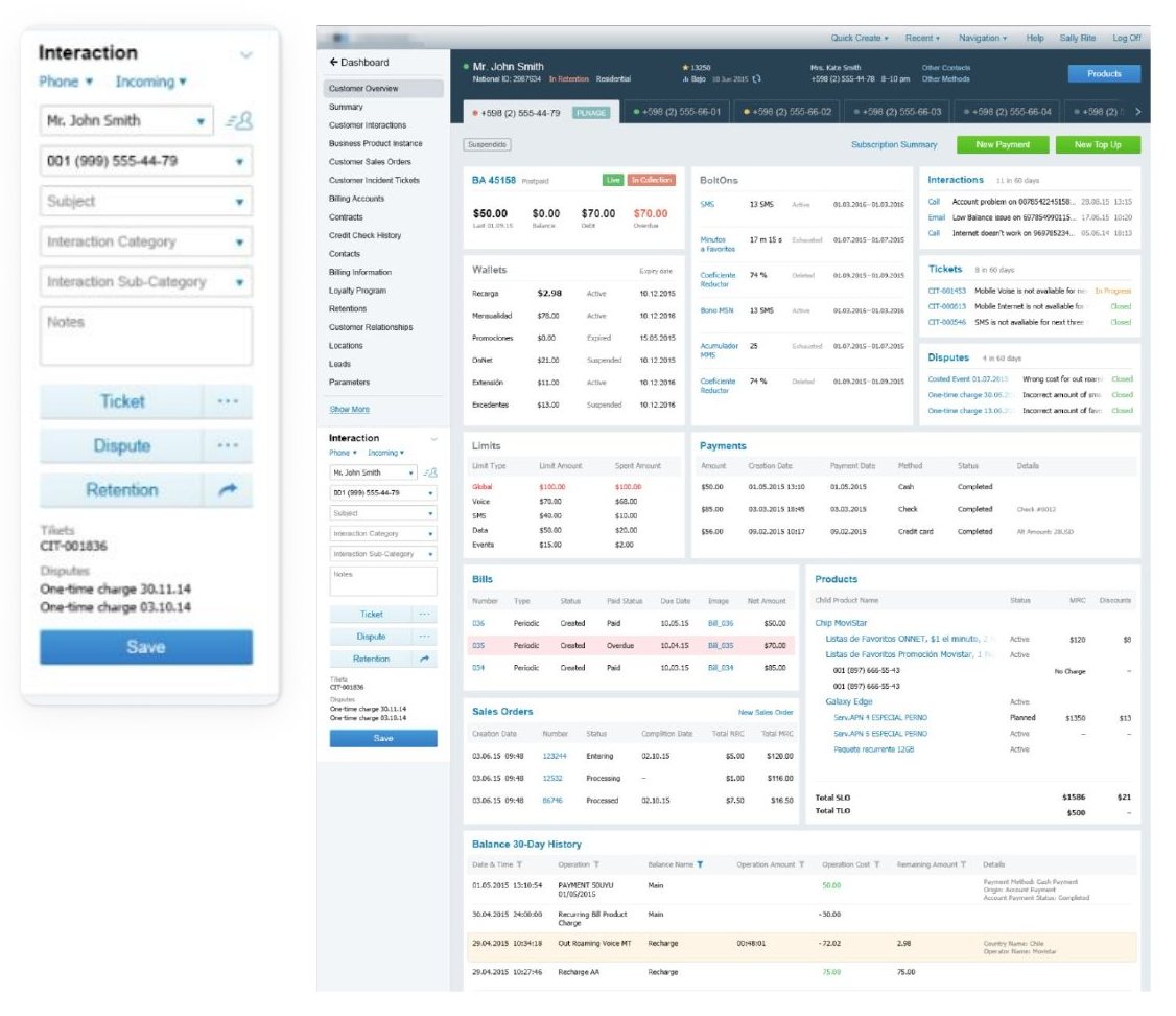
Turn the form into a panel
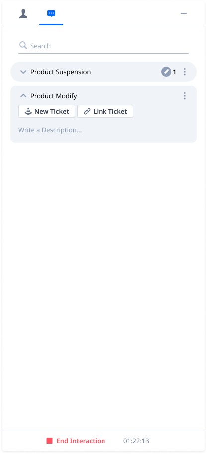
- A narrow panel, detached from the left navigation, that travels with the operator through the whole account.
- Customer info reachable at any step of the interaction.
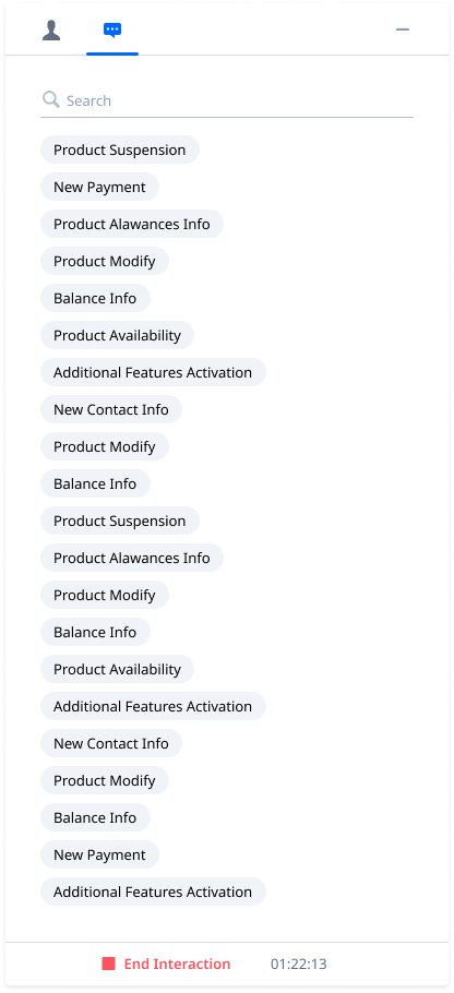
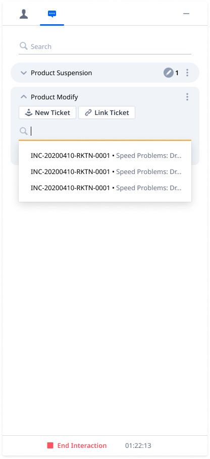
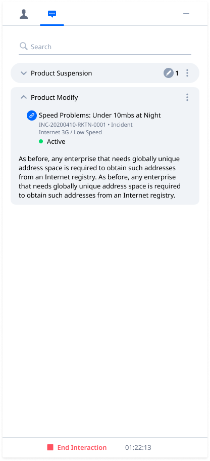
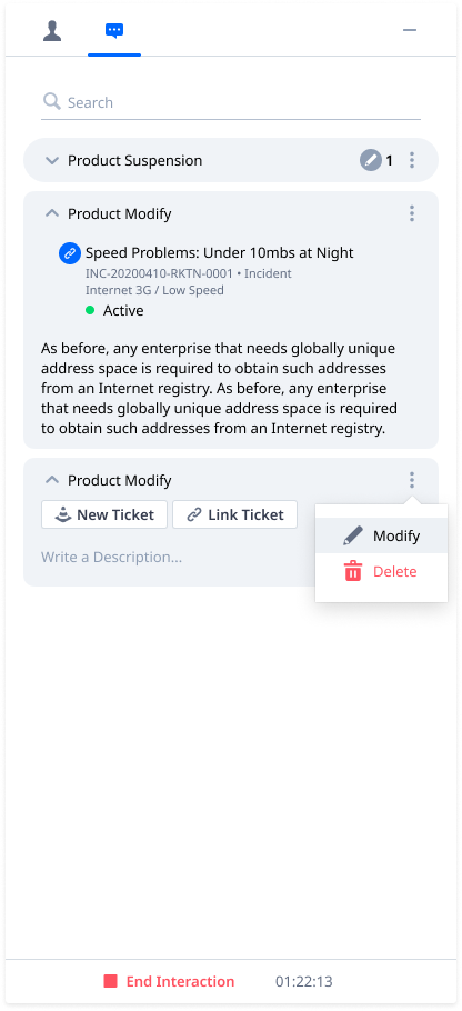
- Popular reasons on the first screen; multiple reasons, each linkable to a new or existing ticket.
Spoiler: two of these ideas survived to the final version.
The eye-candy version — and what research did to it
Sales asked for retention metrics and customer interests so operators could make small talk. We designed a colourful header.
Studies showed 1st and 2nd line don't do retention, interest icons could mean anything, and nobody uploads an avatar when signing a mobile contract. Better to make the call fast enough that no small talk is needed.
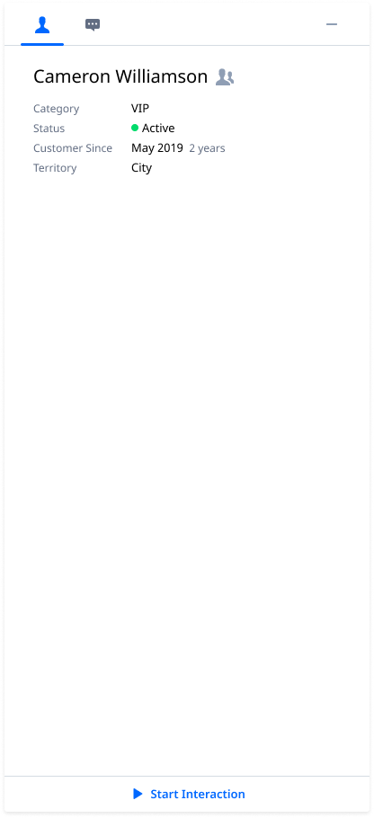
Caller vs customer was now visible — but operators had to memorise which one sat on top. Even the design team needed a moment.
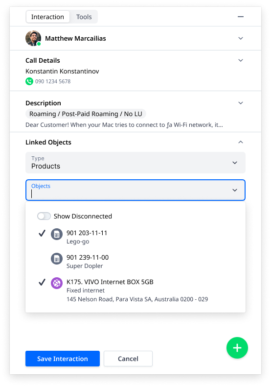
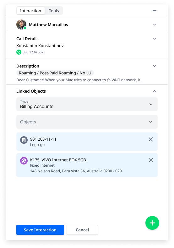
Linking via search worked only for billing accounts and products; tickets were still manual.
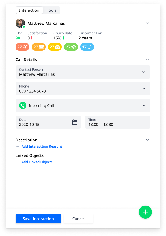
One operator, several conversations
Parallel interactions: while one caller looks for their last bill, the operator finishes an email with router instructions to another customer — email doesn't need an instant reply — and keeps a few chats going.
Profile photos became initials. There was no reason, and no source, for pictures.
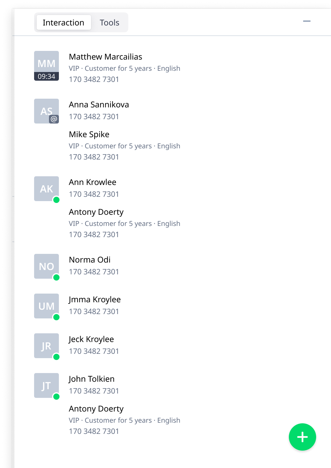
The panel does the logging
Finds the customer. The system searches by phone number and suggests the customer — or, if the caller is a contact person, the customers they represent. One click to accept or decline.
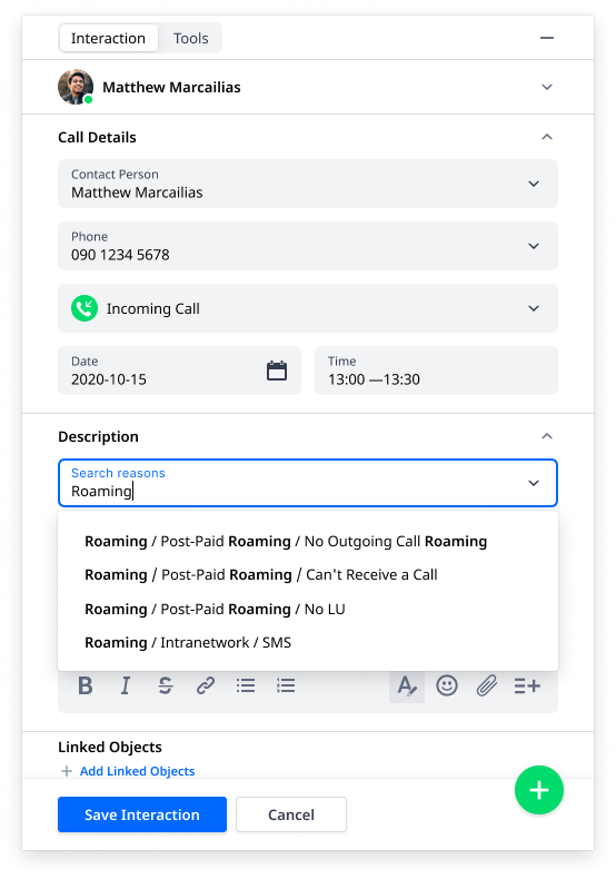
Reasons split from description. Reasons exist to collect service data, so weak spots show up without reading every note.
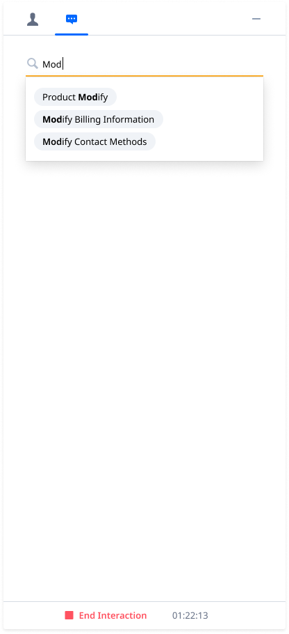
One field for every level. All nested categories merged into a single search — no need to learn a telco's hierarchy.
Linking is back, with suggestions. Open product A during the call, and it's suggested as related; create or open a ticket, and it's linked to this interaction.

One panel, many telcos, no forks
Six designers in 2-week sprints, two ahead of development, split between the core product and customer integrations by load. A 3-tier library kept them consistent.
Netcracker UX system
Atoms: buttons, fields, tabs.
CSRD product library
Filter panels, product cards, navigation — and the interaction panel.
Integration libraries
Customer-specific filter groups and components in each telco's colours.
Where I'd take it next
Categorise via IVR
The caller picks a reason by pressing a number before the operator picks up.
Authenticate automatically
By ID number or secret word, through IVR or voice recognition.
Create tickets at call end
Pre-filled from the reasons and details already logged.
Drop the description
Few fill it in; keep it only where 2nd line must describe reproduction steps.
Compare newcomers' learning curves on v.2015 and v.2021_4 in a real call centre, observe logging in the field, and compare median KPIs over half a year.
Measure learning curves in the office lab, and collect data from customer representatives during integration work.